What's wrong with groov View's Build mode?
Right now the only top-level editable things in groov View are Pages and the Gadgets on them. Everything else is buried in a dialog box of some sort. Devices, for example, get this small dialog box:
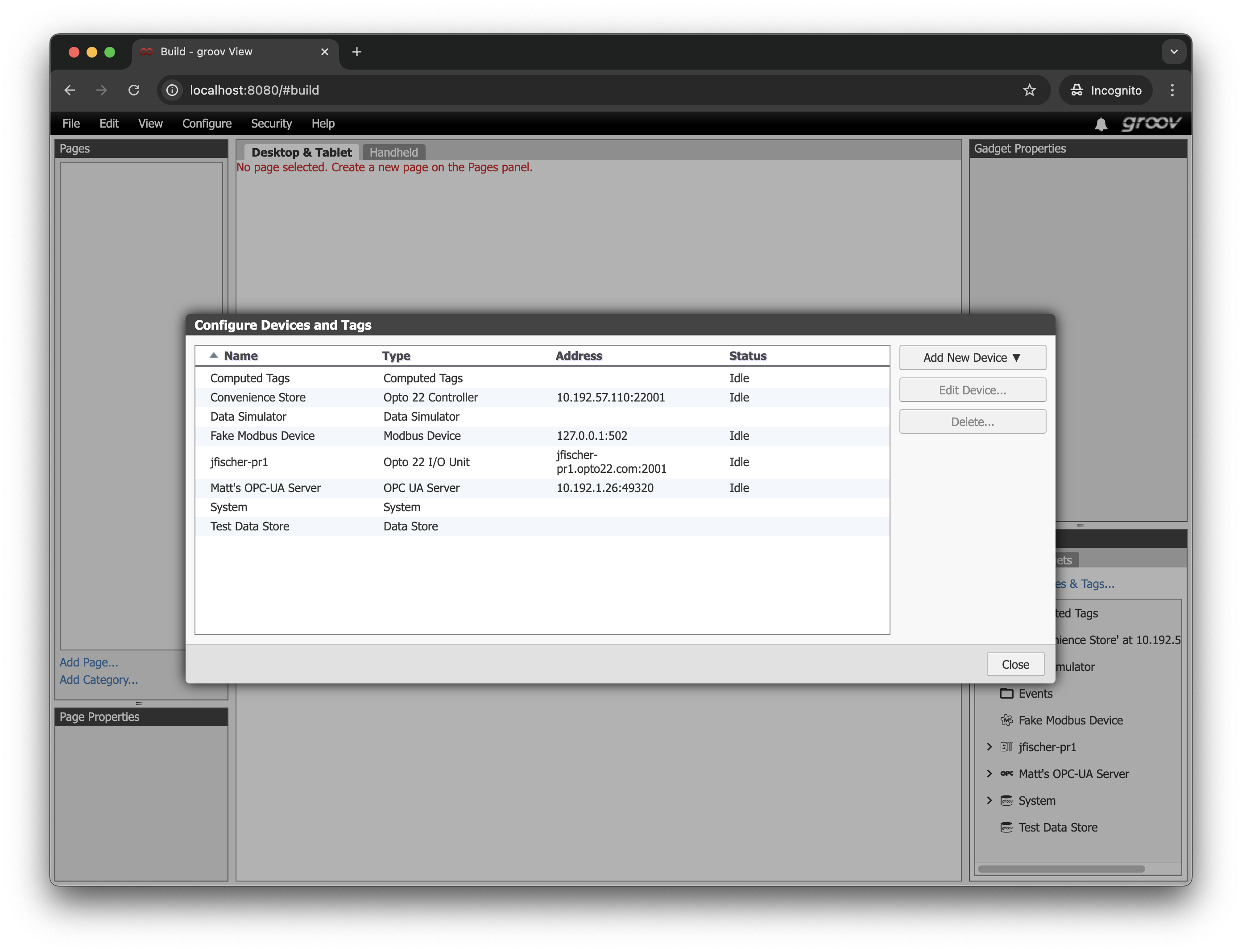
The small dialog box really limits how much functionality we can fit in there, and we end up with stacks of dialog boxes when we need to drill down and configure things.
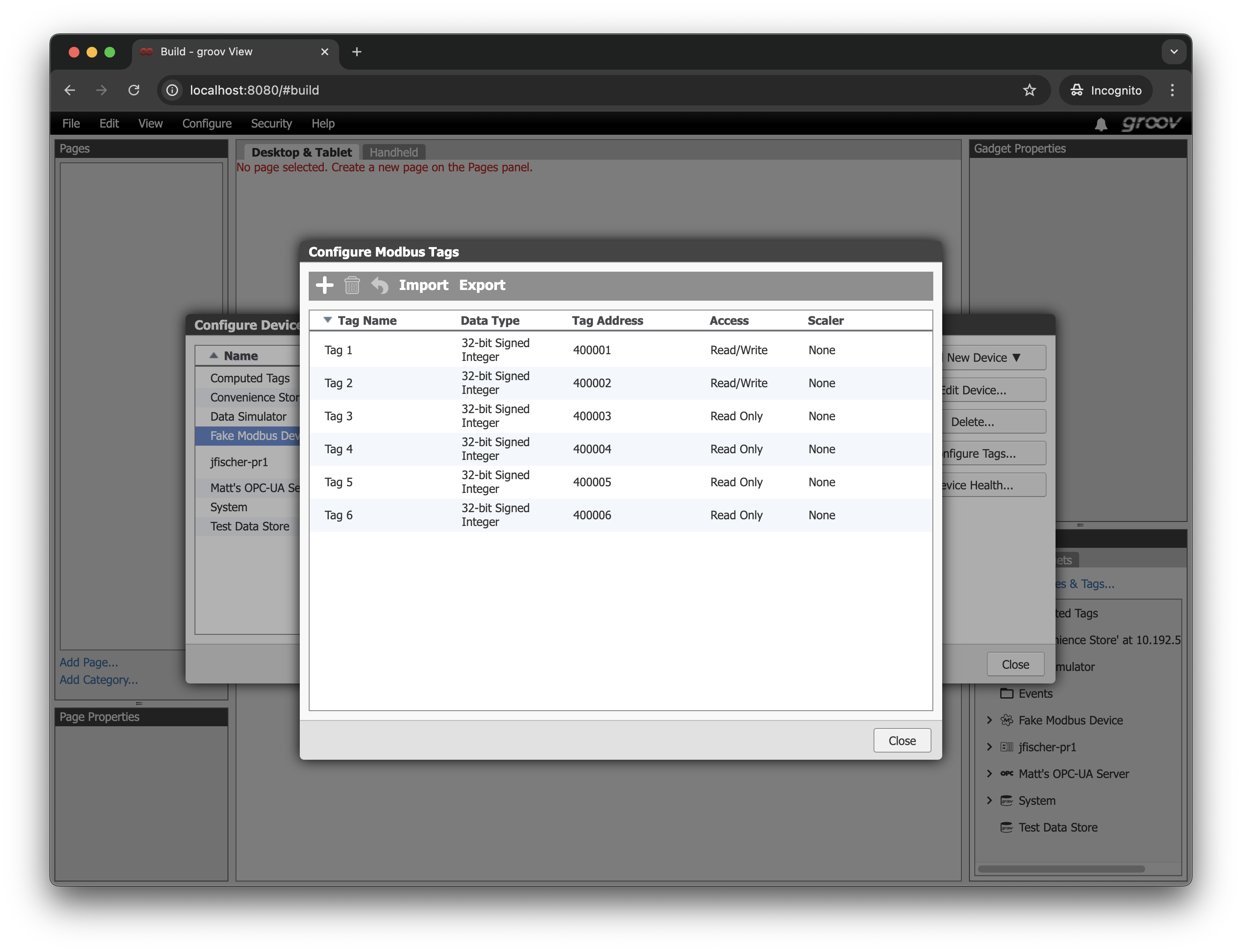
We've made attempts to break out of those dialog boxes in the past, leading to big panels like the Project Settings and Events configuration things, but they're still essentially dialog boxes layered on top of the main page editor instead of first-class things in their own right.
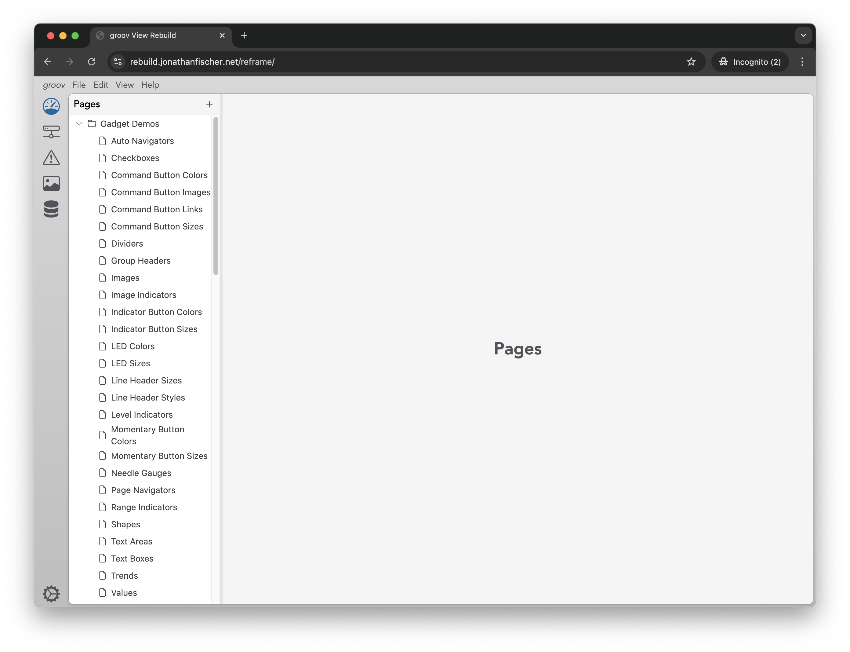
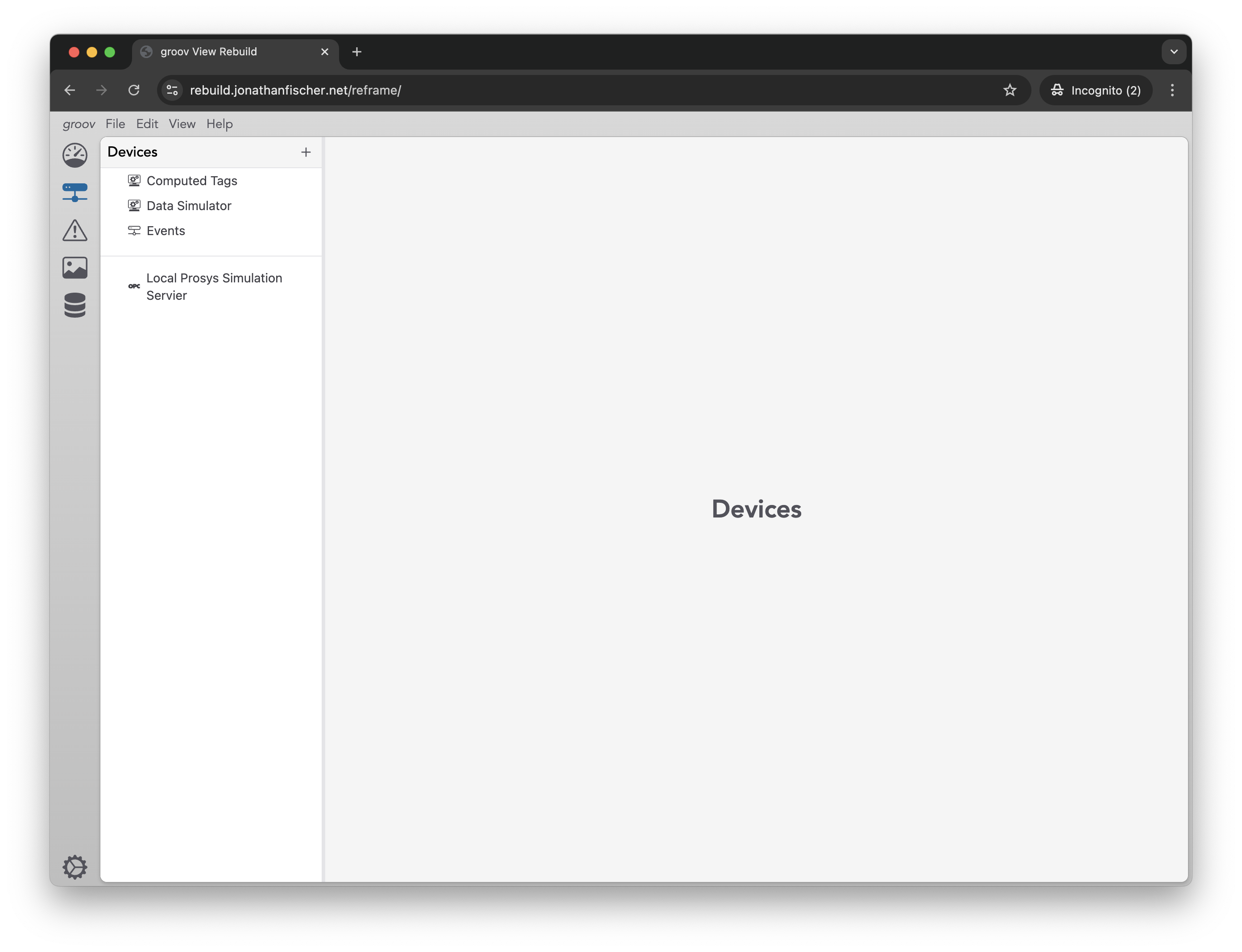
I want to rearrange things a little bit to give me space to put things at the top level. I've been toying with this on and off for years and I've large settled on copying what Visual Studio Code and others do: stick a navigation / tab bar on the left for the top-level areas of concern and leave the rest of the space to change depending on what you're working with.